|
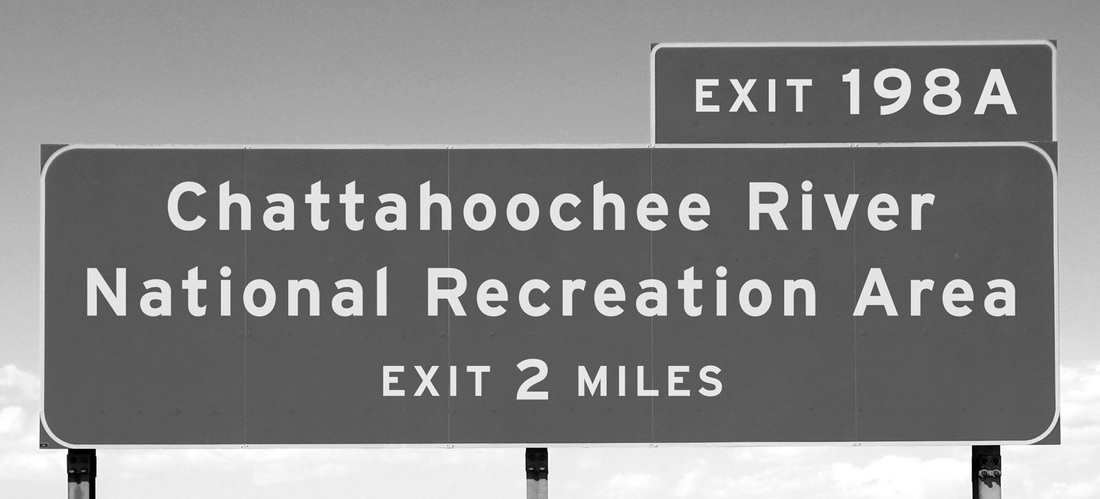
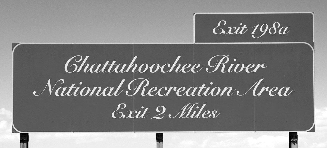
CLO: Students will participate in the creative process (researching) by using the appropriate technology, listening, reading or referencing instructions or tutorials about typography. For example, what’s the difference between these two signs: the text or thetypography?
Typography is the visual component of the written word. A text is a sequence of words. A text stays the same no matter how it’s rendered. Consider the sentence “I like pizza.” I can print that text on a piece of paper, or read it aloud, or save it in a file on my laptop. It’ll be the same text, just rendered different ways—visually, audibly, digitally. But when “I like pizza” is printed, typography gets involved. All visually displayed text involves typography—whether it’s on paper, a computer screen, or a billboard. Is typography an art? That’s like asking if photography is an art. Certainly there are photographers and typographers whose ideas and techniques raise their work to the level of art. But at their core, both photography and typography perform a utilitarian function. The aesthetic component is separate. Being an effective typographer is more about good skills than good taste. Rules of TypographyLeading Leading describes the vertical space between each line of type. It's called this because strips of lead were originally used to separate lines of type in the days of metal typesetting. Kerning Kerning describes the act of adjusting the space between characters to create a harmonious pairing. For example, where an uppercase 'A' meets an uppercase 'V', their diagonal strokes are usually kerned so that the top left of the 'V' sits above the bottom right of the 'A'. Tracking this relates to the spacing of all characters and is applied evenly. Hierarchy and scale If all type was the same size, then it would be difficult to know which was the most important information on the page. In order to guide the reader, then, headings are usually large, sub-headings are smaller, and body type is smaller still. Size is not the only way to define hierarchy – it can also be achieved with color, spacing and weight. All typefaces are not created equally. Some are fat and wide; some are thin and narrow. So words set in different typefaces can take up a very different amount of space on the page.
0 Comments
|