|
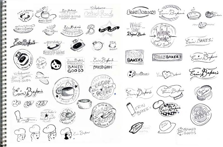
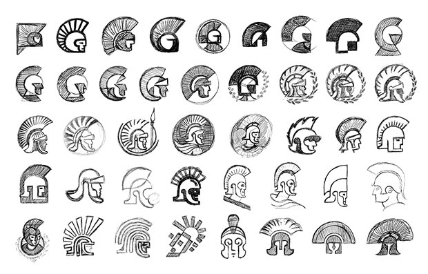
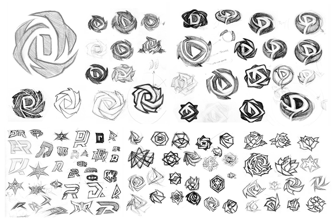
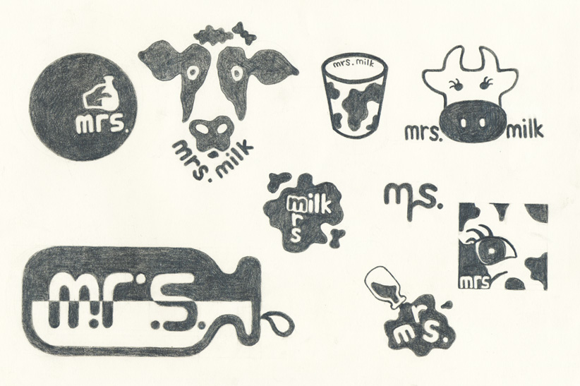
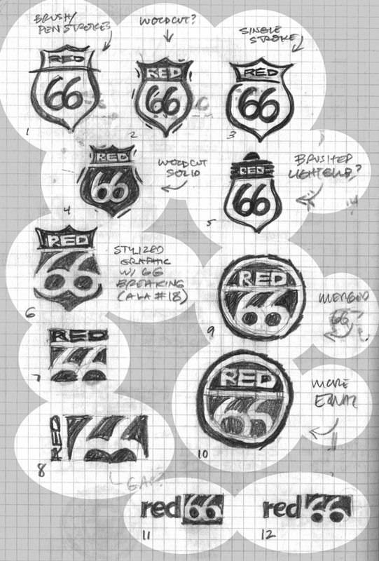
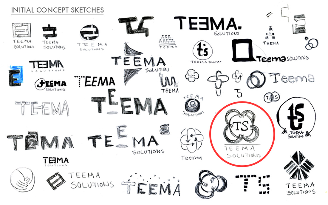
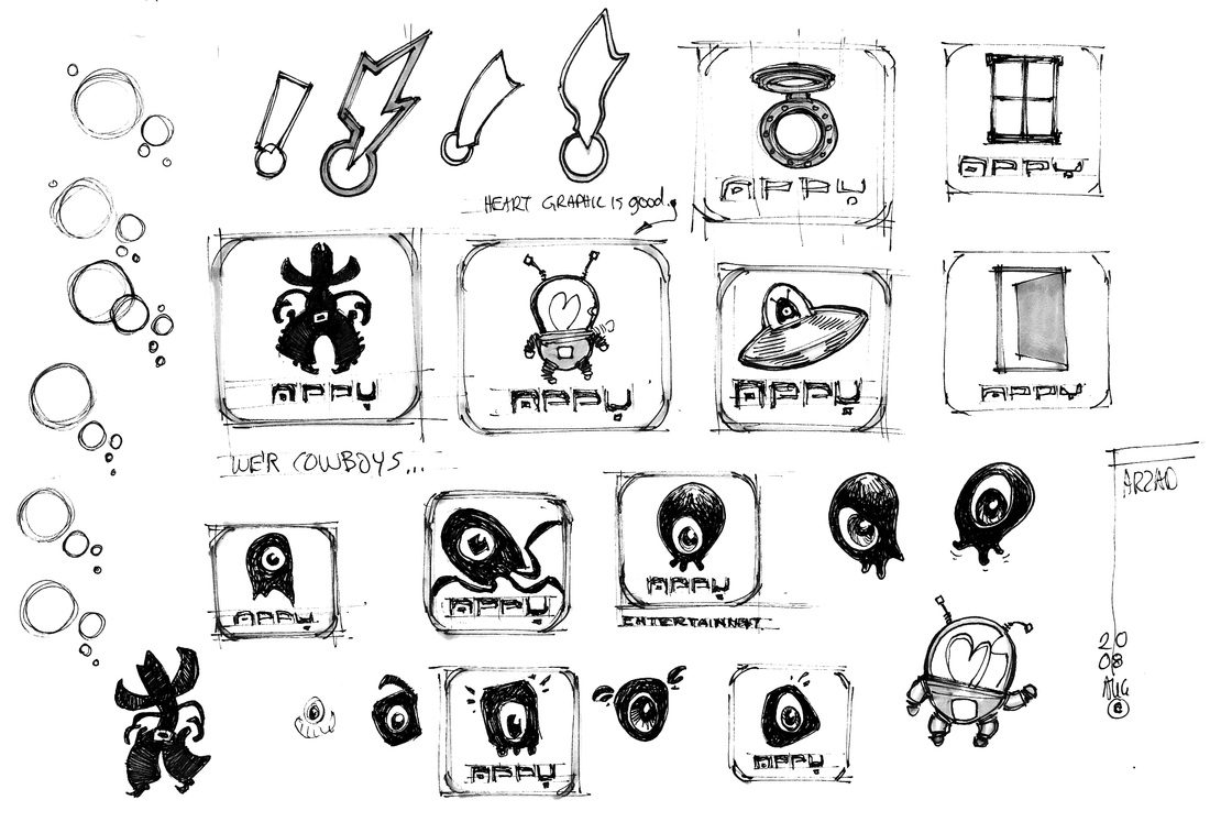
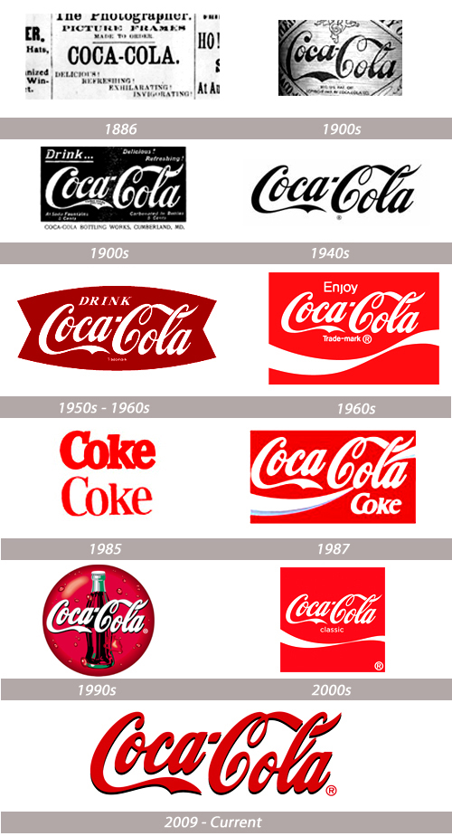
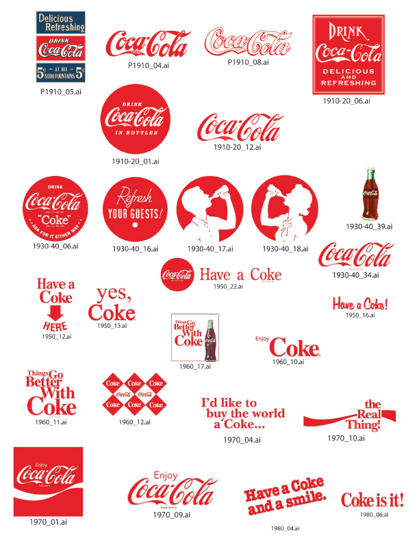
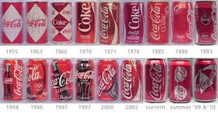
CLO: Students will participate in the creative process of brand identity from conception to final print, by researching logo design, drawing up multiple sketch & a conceptual plan for execution.  You are going to create a logo for your name or a real business. Yes, you may use a family business or club/team at Lincoln. You are going to create an identity based on client needs, location and audience. The entire project will consist of many parts. You must use the design cycle for each part. Right now we are focusing on logo design. You may use Word, Adobe Photoshop, Illustrator, Weebly, Silhouette, google, any digital cameras or art materials needed. You choose what is best for the job. Please put art materials back on cupboard when finished. You may leave sketches on my desk. Project MUST HAVES !!!!
2 Comments
12 Principles of Great Brand DesignJohn Rampton , NOV 14, 2014 @ 08:00 AM CONTRIBUTOR, Entrepreneur helping startups figure out what's happening with Google Branding is something you should be focusing on even in your startup days. It’s much easier (and more cost effective), to get your brand design right the first time, rather than fix it later. However, this can be tough to focus on when you’re just starting out. Keep these dozen tips in mind to stay on track, make the right branding moves, and ensure your company shows off its best self from day one: Stay classic Classic doesn’t mean boring and it certainly doesn’t mean old school or stodgy. It does, however, mean foregoing trends in many area’s such as in favor of traditional fonts, colors with staying power (such as neutrals or primary colors), and being able to see the branding lasting for decades. That’s the goal, right? Match the branding to the company This seems obvious, but everyone has seen a logo that just doesn’t align with what the company does. Let your mission statement and business plan lead the way. If your company is a trampoline business in the ocean off Hawaii, make sure that excitement shows through in the branding. Make sure it can’t be confused with other businesses Recommended by Forbes Sometimes this is unintentional, and other times companies try to ride the coattails of other, existing companies. Get multiple opinions and make sure your branding can’t be easily confused with another company’s. Ensure it works on multiple platforms Is your branding and logo going to work in print, on smartphones, on billboards and in low quality newspapers? It needs to have mass appeal and be clear enough to not get “lost,” regardless of platform Stick to no more than two colors Black and white don’t count, but beyond them only go for one or two additional colors. Anything else is overkill, and you’ll be paying a premium when printers (such as t-shirt screeners), charge by the color. Less is more This goes for font choice, color, actual number of lines and everything else. Take a look at the branding from some of the largest companies such as Subway , Starbucks or Chipotle. They’re actually minimal, easy to recognize, and clean. Remember the name is for life One of the most exciting, yet frustrating things about starting a business is choosing the name. Don’t get swept up in trends, such as opening a breakfast joint called “Hashtag.” Instead, go with something easy to say, spell, and remember. Keep mottos under seven words If you’re including a motto regularly in your branding, such as McDonald’s, “I’m loving it,” the less is more principle also applies. Sometimes it’s necessary in order to make it clear what your company does, or simply to wriggle into the heads of consumers. If you do so, keep it short. Leave plenty of white space White space is free space when it comes to printing, and it also lets your branding breathe. A glob of black and/or colors is unattractive and tough to make out from a distance. Steer clear of sharp edges The lines of your branding should almost always be a little softer and smoother. If you go with sharp lines and edges, such as the “W” in Wendy’s, it can look outdated, unwelcoming, and overly formal. Choose warm or cool tones carefully When selecting a color scheme, before choosing between turquoise and periwinkle, consider what kind of vibe cool vs. warm tones will suggest. Do you want your audience feeling excited, passionate and fired up—or would you rather they feel relaxed, calm, and collected? Warmth and coolness of tone will dictate that. How would the eBay logo look with the letters in light tan, outlined by turquoise? Putrid! The primary colors used on each letter, brilliant. Put some of “you” in there If it’s your company, you deserve to have a little “you” in there. Maybe you adore a certain font, elephants, or your favorite color is a very specific lavender. When you can, let your uniqueness leak into your branding. Most importantly, hire a reputable marketing/graphic design team to help you. I also like to make sure you have clean url’s. This is the face of your business and you don’t want it in the hands of a newbie. UX: User experience |